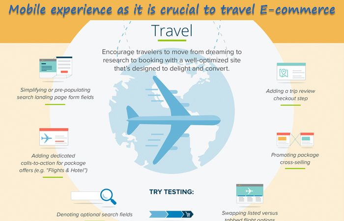
Must be thinking that why Mobile experience is being focused these days? Well the real reason behind it is that it is very crucial to travel e-commerce. If we are going to talk all about travelling, then you must be aware that what customers do to find ways to book their airplane tickets, which are easier in nature and which also saves a lot of time. People are often tired with complex ways to retrieve the information. In this blog, we will provide some essential Do’s that will give amazing mobile experience to the users for various travel websites.
- DO make your MENU Simple and Clean: The needs of the users who are using mobile are different from that of the users who are using Desktop PC and a tablet. The users have a certain set of actions that they want to complete in a short time and that too with the minimal effort. So, to provide this ease to the users, the menu plays an important role. And that is why, it should be made very simple to understand and clean for easier navigation.
- 2. DO Provide Clear and Effective SEARCH: UI plays an important part for effective Mobile UX. We know that Search, plays an important part and by using simple UI design, the travel sites can make it easier for the users to find, for what exactly they are looking for! The search should provide refine search options, so as to provide the exact result for the user’s query.
- DO provide Country redirection along with Local Content: The brands which are of a global nature must show local content which will be based on the current location of the mobile user. The benefit of this feature is that, the user will be able to avail certain offers or promotions on the relevant products, based on the current location.
The above stated important DO’s are there which will help to make an experience of the Mobile user on the travel website more fruitful and amazing. If we see from the UX perspective, then all the above stated points serve as a much stronger prompts!

